constant contact unified payflow
Industry: Email marketing
The problem: Constant Contact had a disconnected front- and back-end, making the transition from site visitor into product user a little bumpy and fairly inconsistent.
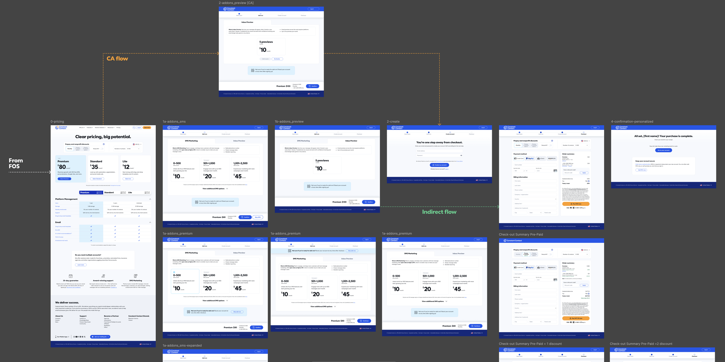
The solve: Redesign the payflow from top to bottom and implement as a single source-of-truth to be used both on site and in product. Because both the front- and back-end systems had a localized version of the payflow and were maintained separately up to that point, the overall experience diverged as the marketing and product teams worked over time. This led to a situation where the user could get a vastly different experience depending on where they entered the payflow stream. Designing one experience provided a cohesive experience for all users and resulted in a lift in V:P and T:P (visitor-to-purchaser and trialer-to-purchaser, respectively) across the board.

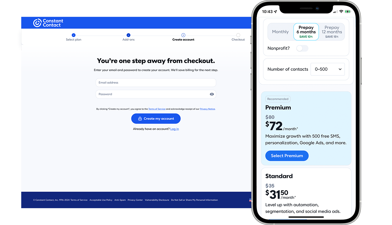
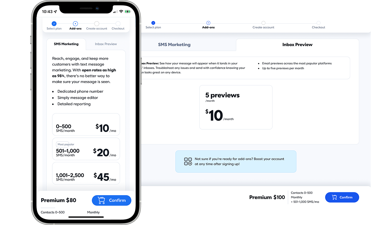
single-stream payflow
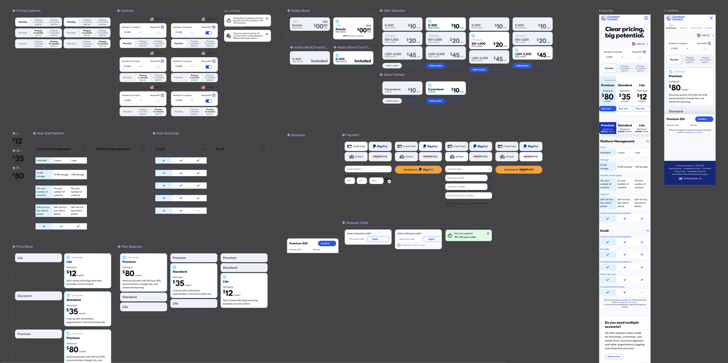
The first step in putting this all together was to figure out what we had on both sides of the fence, what was necessary for them, and what was different between them. Merging the two experiences into one meant taking the best features of either and figuring out how to combine them in a coherent way. A blatant example of this is the progress indicator that at the time was used in product but not on the front-end. These types of features of the payflow were the core of how this entire unified experience was going to come together, and so much research was put into studying heatmaps and usability tests to make sure we were paying attention to things that users actually cared about.
Built-in Options
So while the main goal of this entire exercise was to create a single, unified experience for all users regardless of how they enter the flow, there were going to be some differences between the front-end and back-end flows. And what we designed would have to account for those differences (and in some instances, test into them on one side or the other). For example, Constant Contact plans each have electable add-ons that can be amended to any plan type. Originally, we were going to include add-ons in all versions of the payflow, but after some testing and internal discussion, the intention was to launch with add-ons only available in the experience initiated from product. So not only did we have to design for a series of eventualities, but also make sure that as options were turned on and off that everything else remained intact and the flow still made sense for the user.
Leveraging Technology
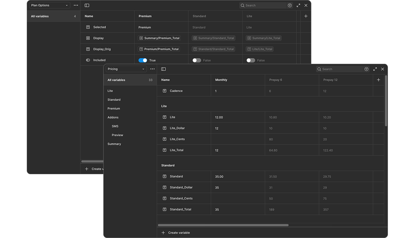
Spinning up a project of this magnitude was no easy feat, and so organizing everything into buckets and heavily relying on Figma components was an absolute must. The components made it much easier to create the prototype experience so stakeholders could truly see the vision for themselves. But the real challenge here was creating a functioning prototype that would respond to users’ compounding interactions: if they click this, then that, then that other option, we wanted to ensure the pricing and options all reflected accurately. The only way to do this was to create databases of variables within Figma and then program the prototype to retrieve from those databases and do the math on the fly. The resulting experience was truly remarkable and helped move the project through the pipeline much more quickly than static designs ever could have.