constant contact site infrastructure
Industry: Email marketing
The problem: As part of a rebrand, Constant Contact had a set of site builder components that was extremely prescriptive and rigid, leading to a website that was repetitive and prohibitive.
The solve: Audit site components for what could be done currently and what couldn’t be done but was needed, and then design to either expand the capabilities of existing components or create brand new components. The process involved not only designing the end product but also the interface within the CMS: designing the UX for both the site visitor as well as the site experience admin users. Once the design was set, aligning with the dev team in order to make sure every option we were building in functioned correctly for each component, and that it all worked for each of the site’s five breakpoints. The result of all this work was a more robust set of components that could handle much more than they were originally designed. That, in turn, lent itself to a more visually-varied site that was able to cater content to users in a more custom manner. Because of that, we were able to craft content in a way that would generally lead to a bump in V:T (visitor-to-trialer).
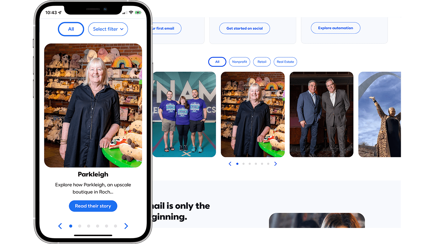
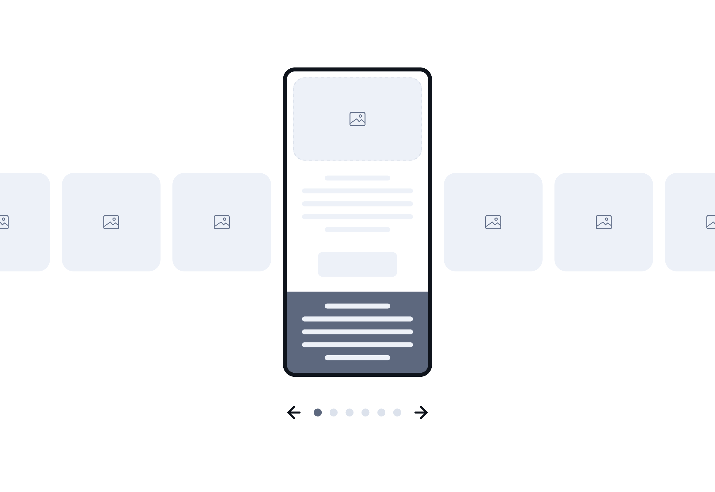
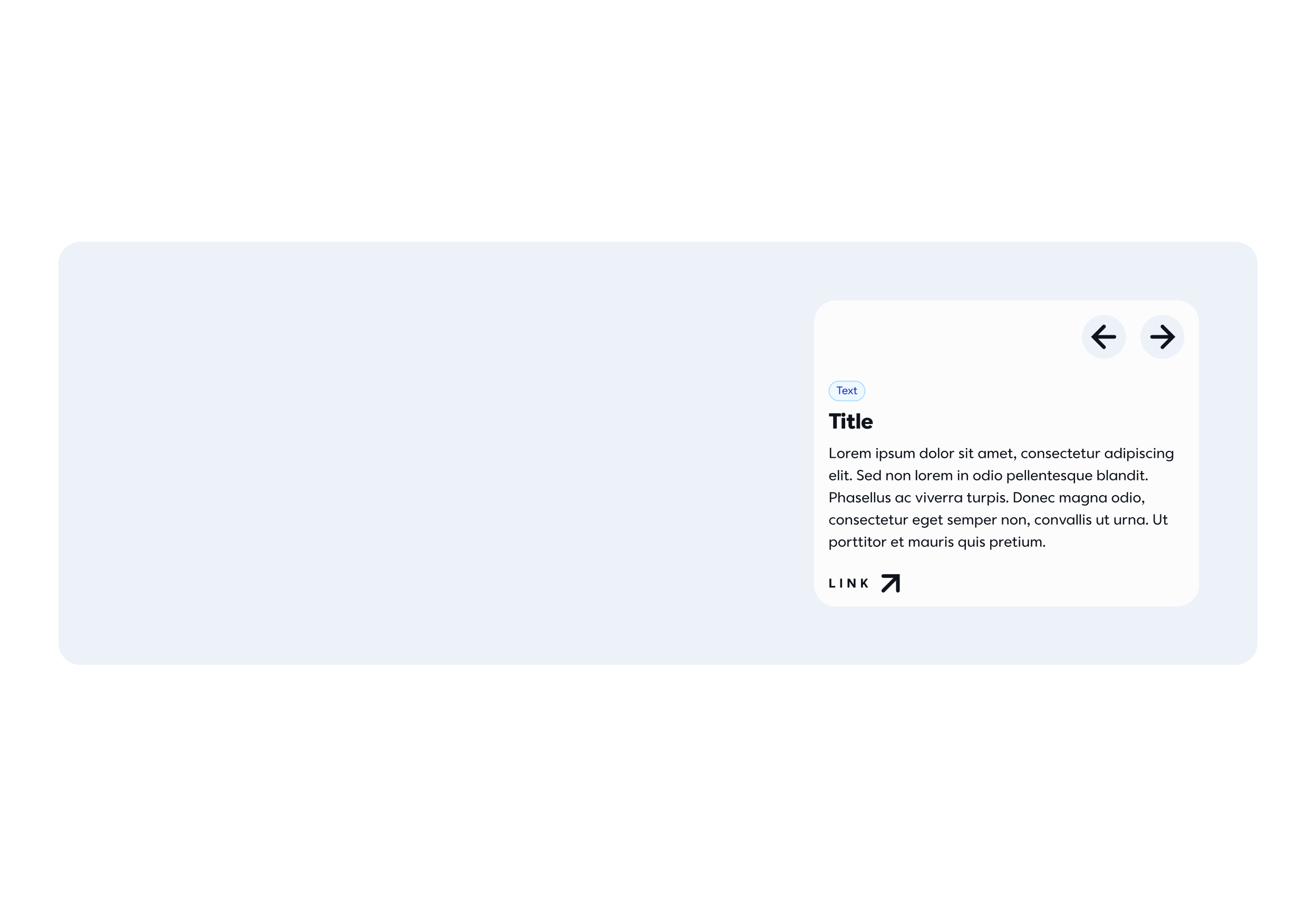
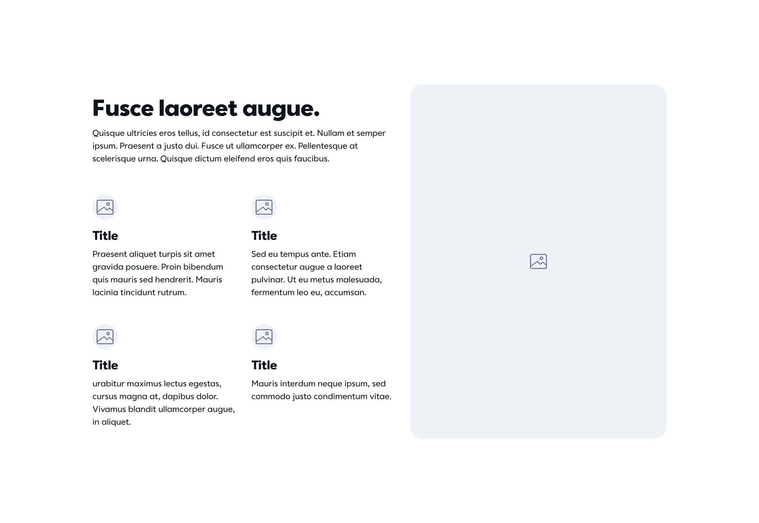
Gallery Carousel
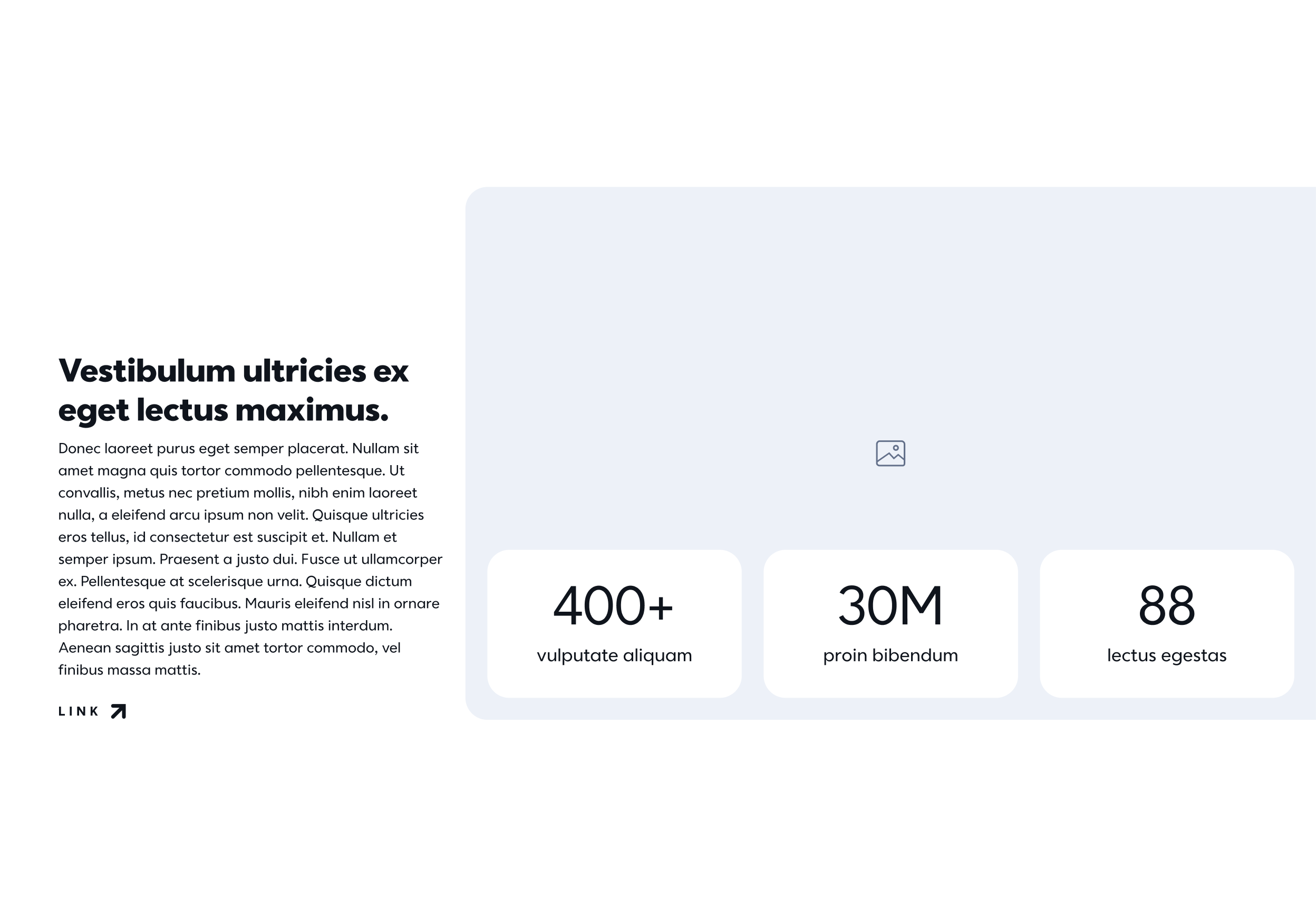
This component works as a browsable gallery component. Prior to the implementation of this new component, all gallery-esque assets on the site were achieved through the use of static images. This of course created a lack of interactivity and accessibility but also didn’t add much value for the user. This new component could display images, video, and cards, the latter of which was important because it essentially replaced the card carousels that were then-available but with far more capabilities.
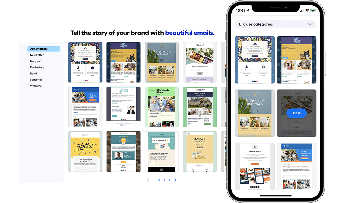
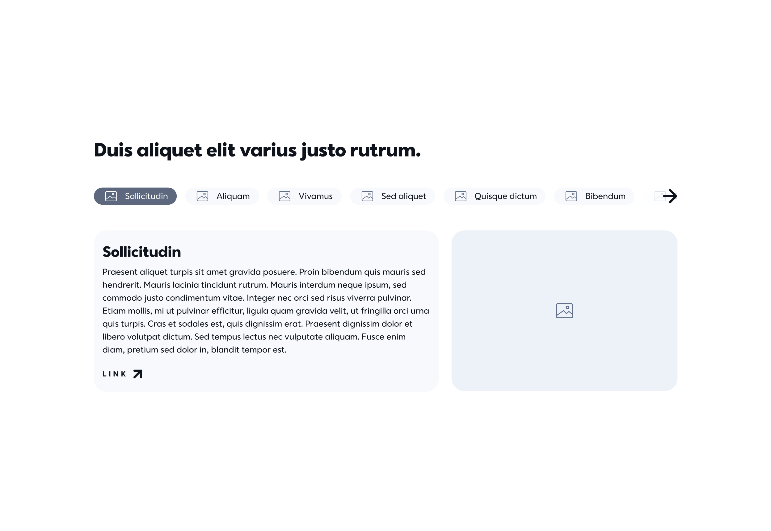
Template Gallery
While the Gallery Carousel solved the problem of having a simple, surface-level, browsable gallery of assets, it wasn’t suited for instances where the user needed to view, sort, and filter a number of assets at once. This component is more geared toward viewing things as a library rather than just a curated selection of elements. With a tool like this, we could actually bolster marketing on things like email templates and product integrations in a way that users could self-service information in a meaningful way.
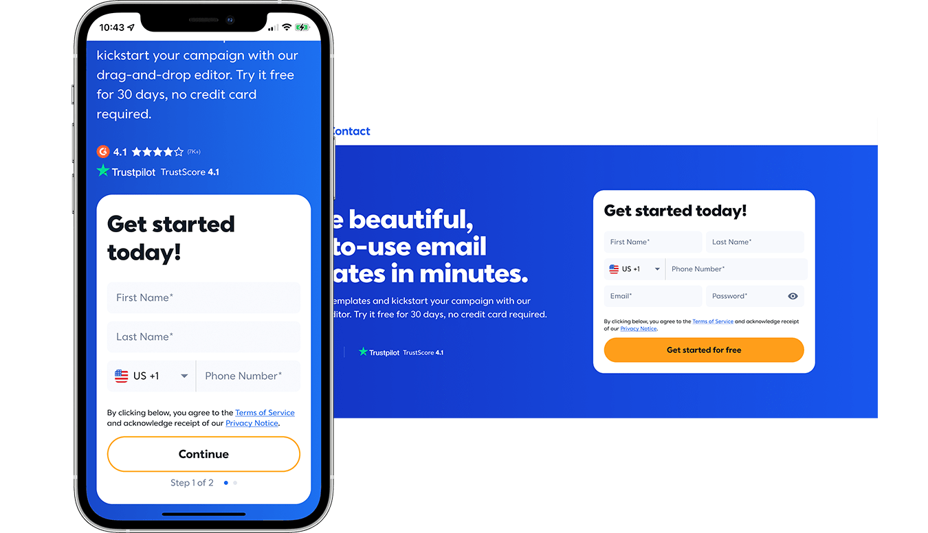
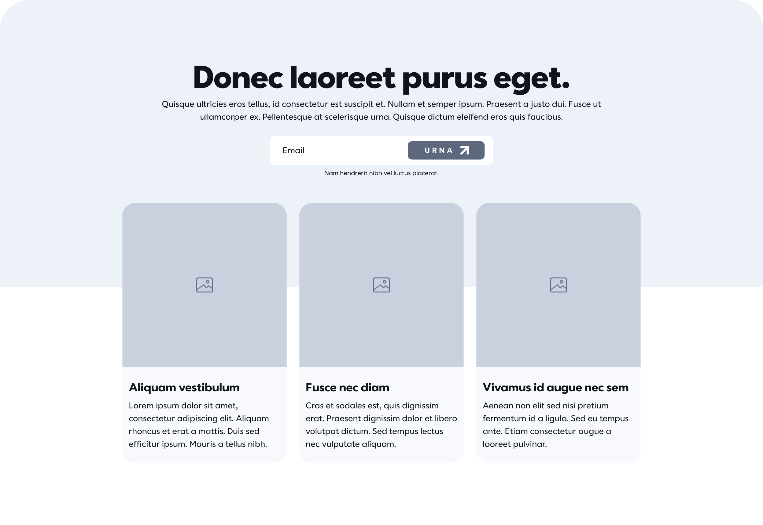
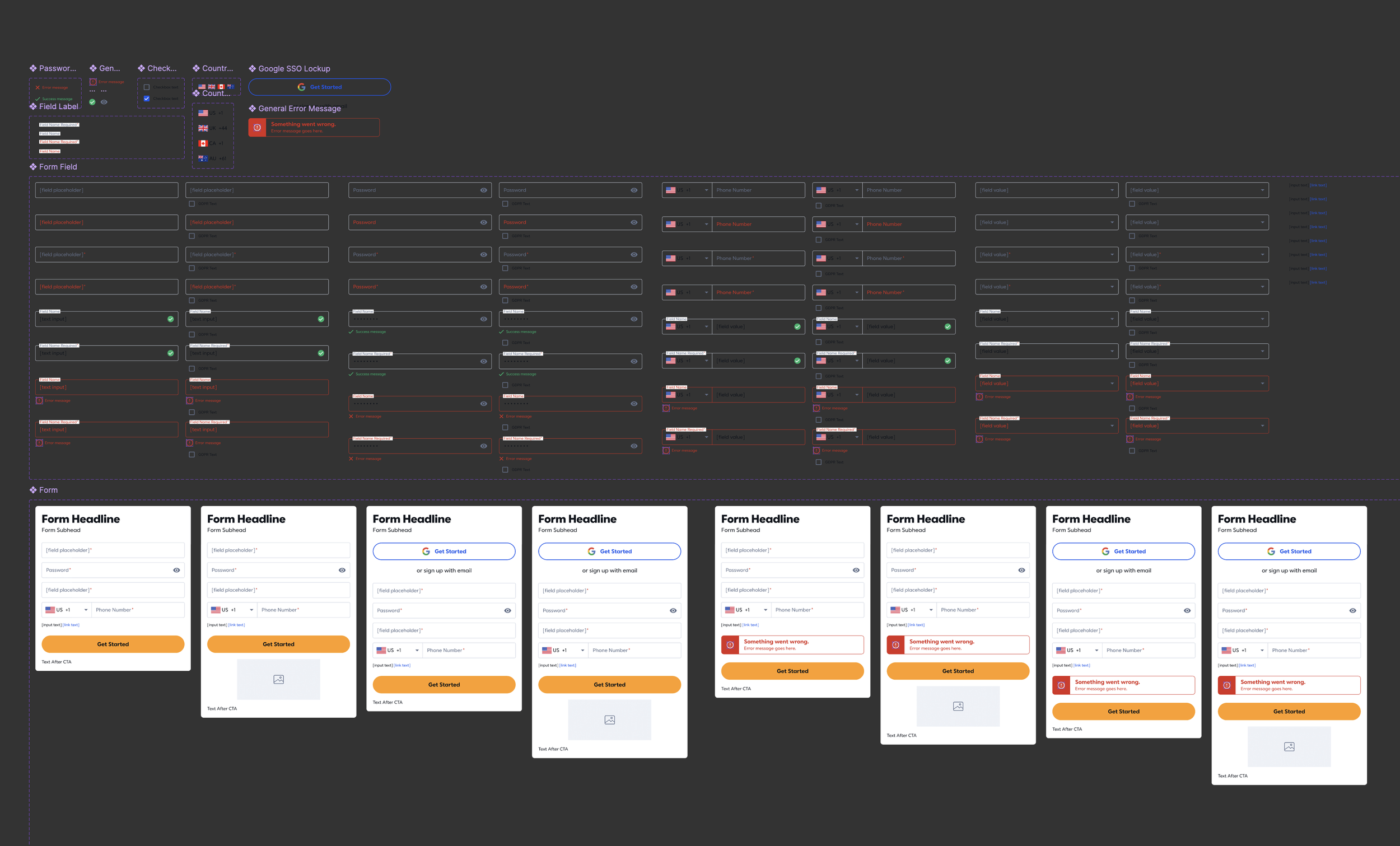
Signup Form
The signup form is a hallmark of any great acquisition landing page, and that is true for those done at Constant Contact. However, the form itself suffered from clunkiness and was in need of some TLC. As we were trying to test the effectiveness of the form, inserting different input fields, changing the order of fields, et al, a major problem that arose was the sheer length of the signup form. We were looking to achieve something a bit more tight and compact without making things too crunched. The obvious solve here was enabling the ability to place fields side-by-side throughout, but we also took measures to tighten up padding and margins as well, and of course, addressed the UI a bit just to give the entire thing a little glow-up. We even put together designs to start testing out multi-step forms, since all the research I came across indicated it would give a nice boost in conversion rates.
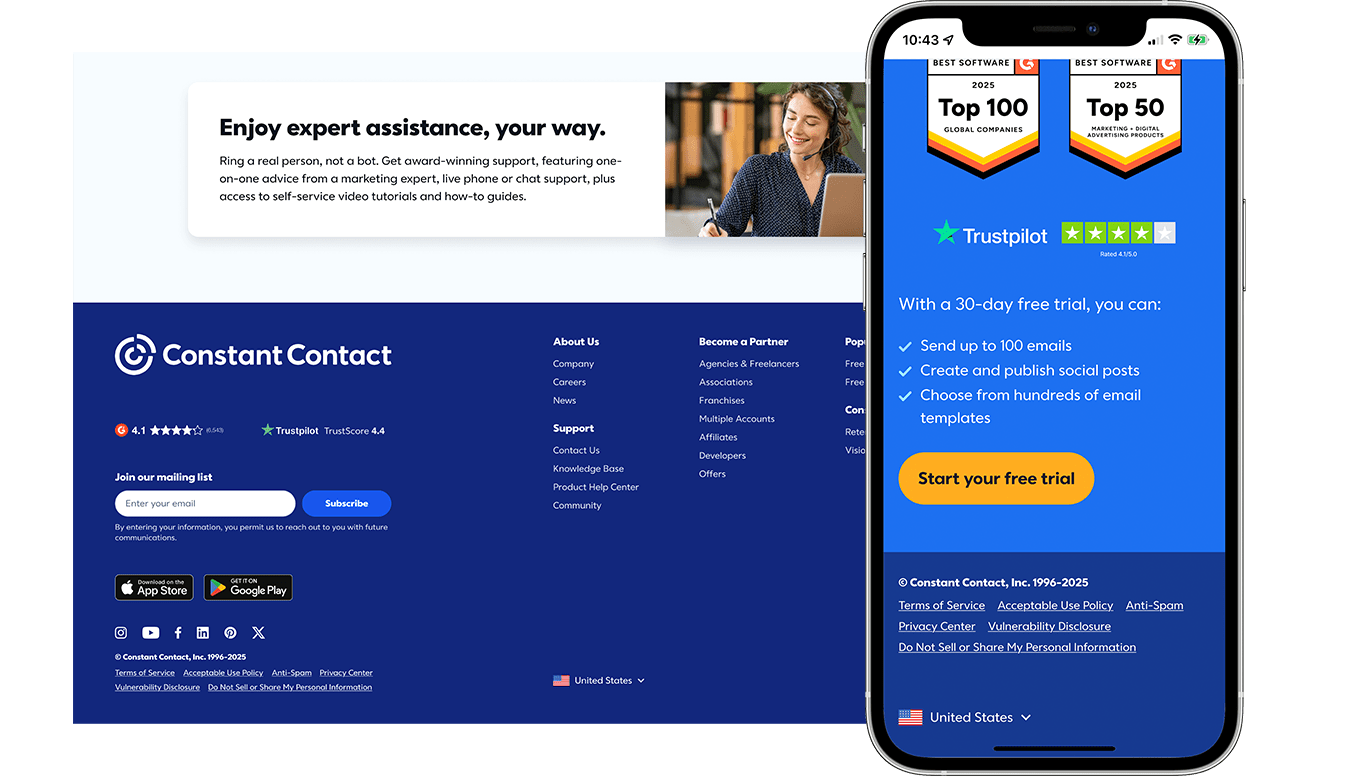
Footer
The site footer is a component in and of itself, and it hadn’t been updated in quite awhile. There were several things that stakeholders wanted to incorporate — online review platform scores, language selector, app store icons — and so while we were already tinkering around in there with those items, we took the opportunity to give the entire footer a facelift. While the visual aspect of the footer took a sharp turn into modernity, it also became much more streamlined for use across site pages, which feature the full footer, and acquisition landing pages, which feature a footer cut down to essentially the legal links. So while a seemingly simple ask, I was able to improve UX/UI for both users and admins.
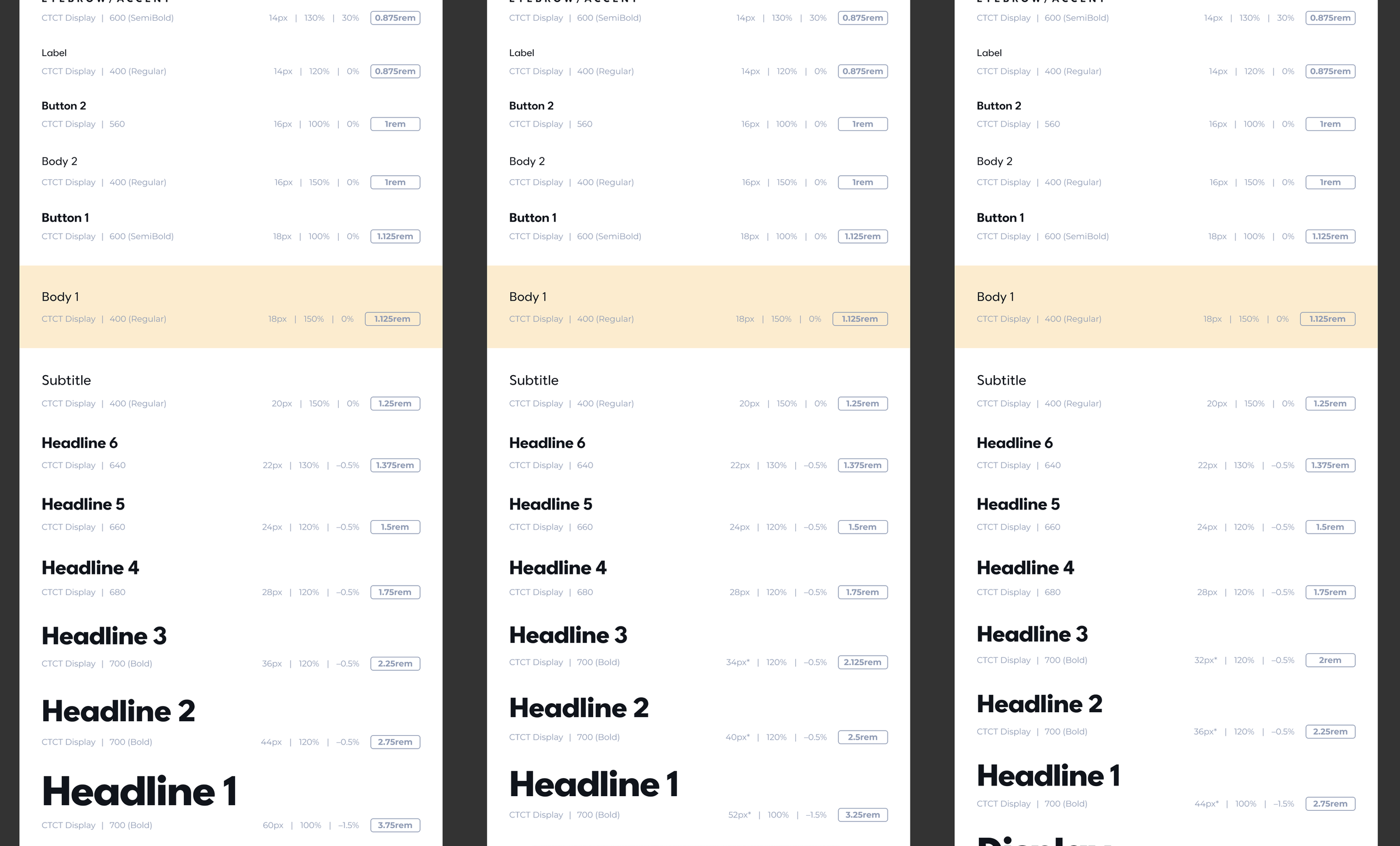
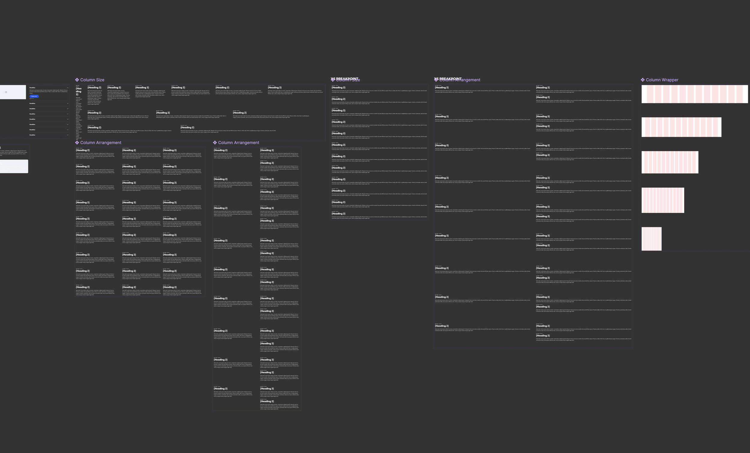
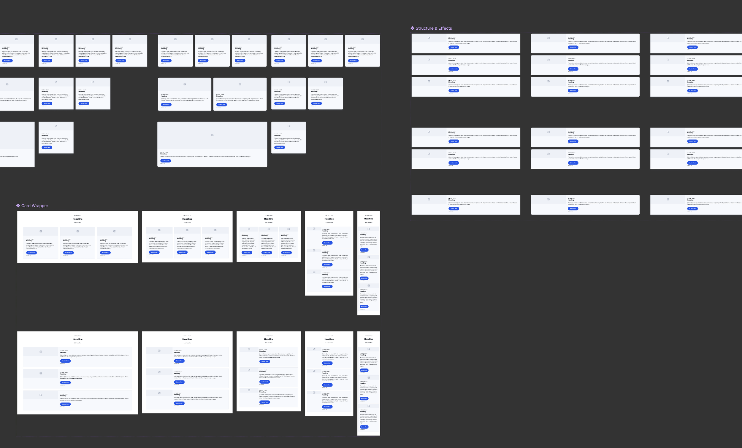
In addition to the component work, there was a problem in the web design process in that everything was disconnected — designers were copying and pasting from design to design rather than having a design system serve as the source-of-truth. In addition, by not connecting colors, typography, and logos to a design system, each design varied in a state of up-to-dateness. Identifying this as a problem, I gathered all brand data into one design library and shared this out with all members of the organization. For the site components, which suffered from the same “is this or is this not current” issue, I used the CMS to identify all existing site components, created mock pages with instances of all those actual components showing every possible option, then from that created true-to-life facsimiles of each one in all existing breakpoints. This served as the 0,0,0 which could then be revised over time as changes to those components were made in the system.
Future Thinking
In addition to all this in-the-now problem-solving, I was always on the lookout for where we could go from there. So while I always keep actual use cases as a starting point, the exercise over time was just to create some new, different stuff that could potentially be used in the future. No particular goal in mind other than just creating a repository of layouts and UX that could be browsed as a source of inspiration. Some of these ended up informing what we did with certain components and layouts, others became components entirely of their own, and some are yet to blossom.